
TrackPack Stats: Building a Platform to Unblock Our Statistician
2026-04-01
TL;DR
The Food, Policy, and Health research group at the University of Calgary had a statistician who was getting pulled into routine descriptive work instead of the heavier analysis that actually needed her expertise. Lead researchers also wanted real-time visibility into the data collection process, which the current reporting cadence couldn’t give them. I built a self-serve web platform that solved both problems: a form-driven reporting flow for on-demand descriptive analysis, and an observability dashboard for tracking what was happening in the field as data came in. Reports that used to take a week now took minutes, and the statistician’s time shifted back toward the work that actually required her.
The platform sits on top of TrackPack, a mobile data collection app used by research assistants across Canada to tag packaged food products.
Gallery
Background
A common problem for research groups is that data collection is easier to scale than insight. You send more researchers to more locations, you enhance your tooling to collect richer data, and the result is a dataset that grows faster than your ability to process it. The bottleneck moves to analysis, and analysis usually means a statistician.
We ran into this problem at our research lab. I had built a mobile app called TrackPack that let researchers across the country collect detailed data on packaged food products. This effort was going well, well enough that our statistician who was very capable was getting overwhelmed. The volume of demand was part of it, but the real problem was the composition: lead researchers were coming to her with small ad hoc requests (quick counts, descriptive breakdowns, slices of the data) that crowded out the inference-heavy, methodological work that actually required her expertise. Lead researchers also wanted daily visibility into the day-to-day data collection, which the typical weekly reporting cadence couldn’t give them.
Hiring another statistician didn’t seem to be the right answer. Most of what people were waiting for wasn’t statistically complex; it was just inaccessible without knowing some R and being familiar the data model. So, the goal became leverage, not replacement: cover the routine descriptive work in software so the statistician’s time could go toward the questions that actually required her, and solve the visibility problem directly with a live view into the dataset. Since much of the ad-hoc reproting had spilled over to my desk at one point or another, I had a good sense of what the stakeholders needed and this allwed my approach to be as broad but as opinionated as possible, not general-purpose and extensible (which, I’ve got to admit, is always tempting from a software engineer perspective). Within the timeline we had, an opinionated version had a narrower scope and thus had a good chance of working well enough to solve this problem.
What I built
The platform is a React web app (MUI components, Redux) with an Express server running the typical backend chores and the R analysis jobs. Access is gated to researchers on the team, since the dataset isn’t public and the platform exposes raw collection activity that wouldn’t be appropriate to share outside the group.
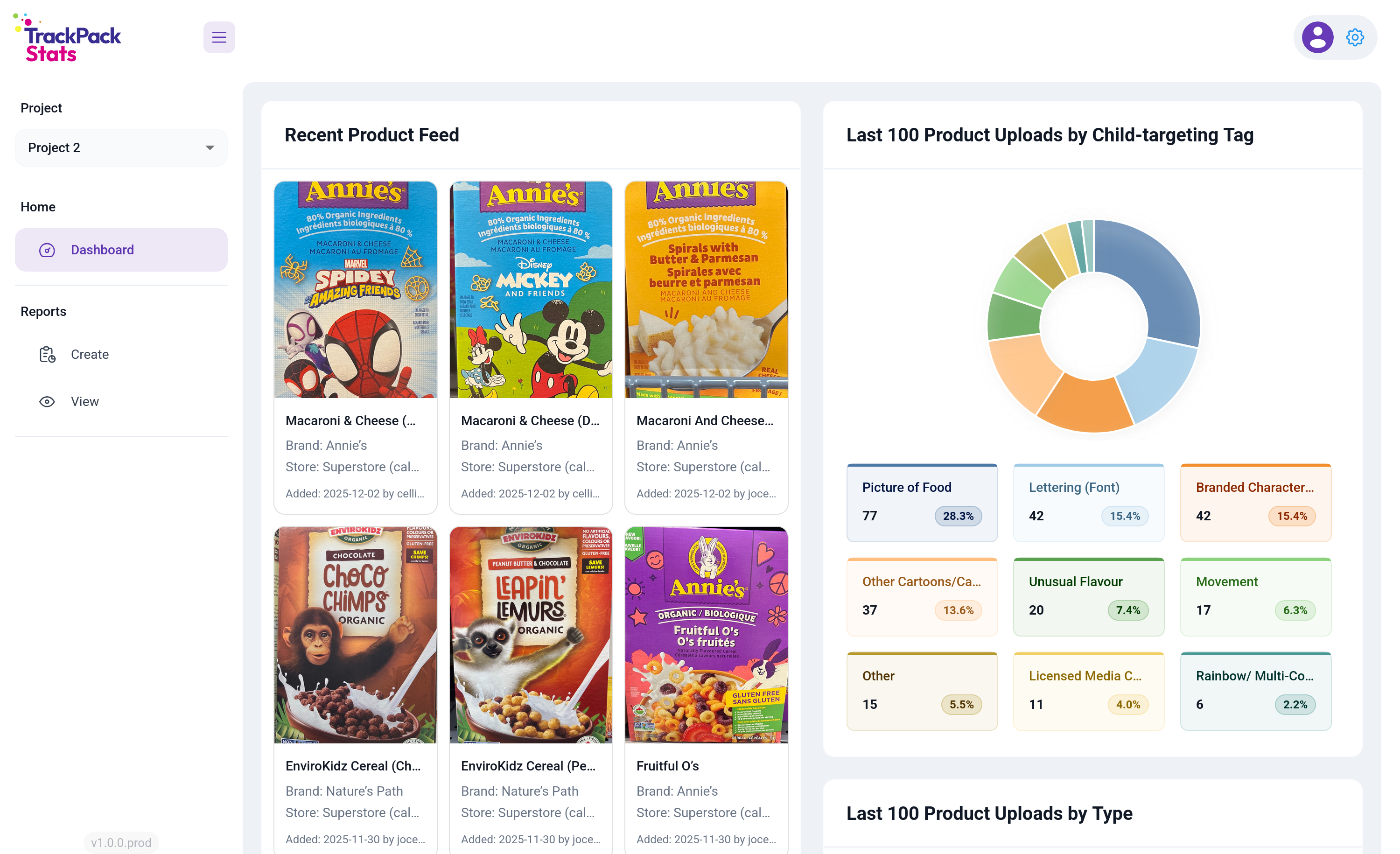
Once you’re logged in, you land on the observability dashboard. Lead researchers were the heaviest users, and most of their sessions started with the same question: what’s happening in the field right now? Rather than make them navigate there, I put that view on the front door.
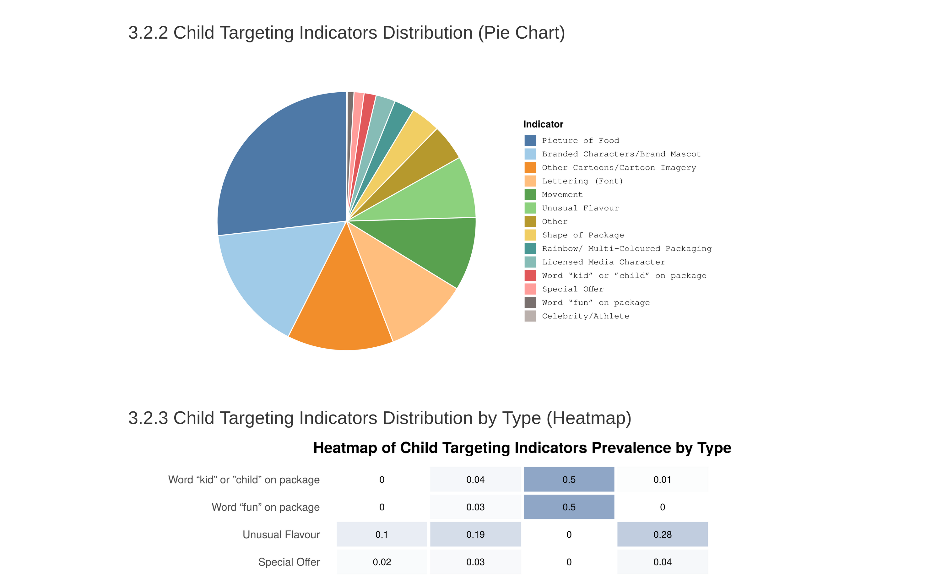
The left panel shows the recent product feed pulled live from Firestore (last products tagged, with image, store, and RA). The right panel breaks down the last 100 uploads by child-targeting tag, the most subjective attribute researchers collect and the one where interpretation drifts most easily across the team. Putting that distribution in front of lead researchers every time they logged in gave them a daily feedback loop on tagging consistency without requiring anyone to go look for it. Scroll further and there are more visualizations: last 200 products by uploader, last 100 products by type, and last 100 products by location.
The left nav covers the rest of the platform: Dashboard for observability, Reports for on-demand analysis (split into Create and View), and a project selector for the different siloed data collection efforts.
The reporting flow
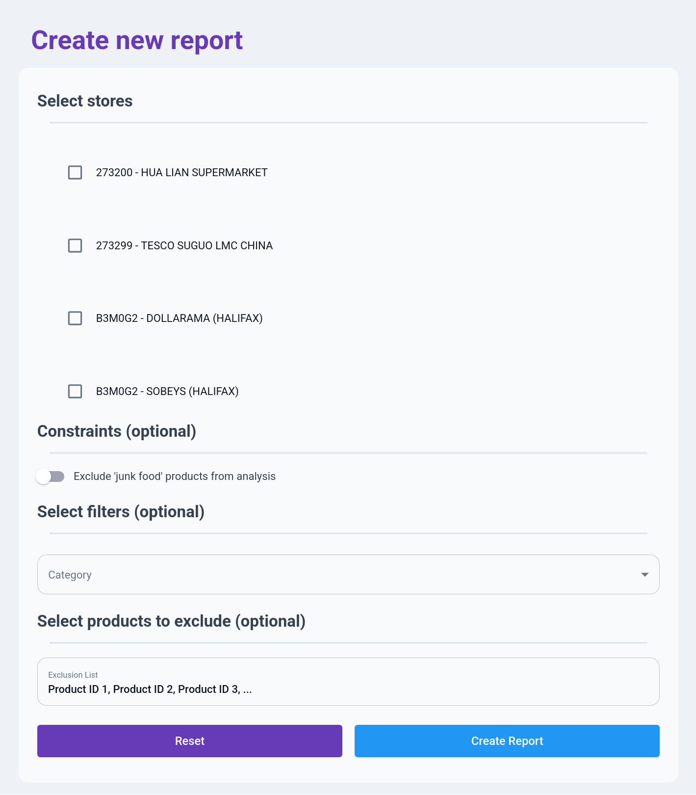
The reporting flow is the on-demand analysis half of the platform. A researcher defines a slice of the data, runs an analysis, and downloads the result. A form-driven tool like this lives or dies by whether filling it out feels faster than emailing the statistician, so every field had to justify its existence.
That’s why the form is deliberately short, with required inputs at the top and optional refinements below. Someone who just wants a full report on a few stores can pick the stores and hit Create Report. And the fields are organized around how researchers actually think about the data: stores first, because every question starts with “which stores”; then a junk food exclusion toggle for the filter that comes up constantly; then a stackable category filter for slicing across location, store type, product attributes, and so on; and finally an exclusion list that accepts raw product IDs as a comma-separated paste, which is dead simple but matches how researchers actually work.

Once a report is created, the R pipeline runs on the server and the result shows up in the View tab. Expanding a row reveals the filters used to generate the report as tags: “exclude junk,” “Superstore,” “Safeway.” Researchers ran a lot of reports over the course of a study, and without the tags, finding a specific past one meant opening them one by one.
Correctness
Getting the analysis right was critical, because obviously a platform that delivered wrong answers faster would be worse than having nothing at all. Two things really worked in my favour here.
The first was that I knew the data model deeply, because I’d designed it. The dataset had 40 to 50 attributes per product across a mix of structured and semi-structured fields, and I knew exactly which strings were structured and how, which assumptions were safe, and which weren’t. That let me front-load validation and catch shape problems at ingestion rather than during analysis. Even where upstream was supposed to enforce structure, I found it worth duplicating those checks downstream. Partly to catch drift, and partly because the assumptions I’d baked into my own analysis weren’t always the same ones upstream was enforcing.
The second was having a built-in check on my work. I could run my outputs against analyses the statistician had already produced on the same underlying data, and I’d expected that to mostly be me validating against ground truth. What actually happened was that it surfaced errors on both sides. Places where I’d misunderstood the analysis, and places where she’d made assumptions about the data model that didn’t hold. Neither of us would’ve caught those alone. It took both of us looking at the same output from different angles.
Outcome
Reports that used to take a week turn around in minutes. The platform has been used to generate hundreds of reports to date, and the statistician’s time has shifted back toward the inference-heavy work that justifies having a specialist in the first place. Lead researchers use the dashboard as part of their daily routine, and the tagging-consistency feedback loop has caught drift in real time more than once.
Final thoughts
Specialist bottlenecks exist in almost every organization. The reflexive answer is to hire more specialists, but most of the time the real lever is tooling. Figure out which part of the specialist’s work can be moved into software and which part genuinely can’t, build carefully for the part that can, and protect the specialist’s time for the part that can’t. It’s less glamorous than building general-purpose platforms, but in a context with one developer, one month, and real stakes, it’s what actually works.